Health and environmental impacts of solid waste management strategies

Overview

This page will discuss the health impacts associated with waste incineration (and its associated ash disposal) and with landfilling. Health impacts are driven by pollutants that contaminate the air, surface and ground water, and soil. Environmental considerations are discussed in the “How do incinerators compare to landfills?” section.

Background

Given that health impacts are driven by pollutants, it is important to understand what pollutants are known to be harmful and how levels of these pollutants are regulated.

Many (but not all) pollutants that have known harms are regulated under the Clean Air Act (CAA). (Notable exceptions include “forever chemicals” (PFAS substances), which are regulated in a different way.)

The CAA separates pollutants into two main categories that are regulated differently: criteria pollutants and hazardous pollutants.

Criteria pollutants

Criteria pollutants are the following six common pollutants that the EPA must regulate under the Clean Air Act by setting National Ambient Air Quality Standards (NAAQS).

More information: Criteria air pollutants
  • Particulate matter (PM)
  • Ozone
  • Sulfur dioxide (SO2)
  • Nitrogen dioxide (NO2, NOx)
  • Carbon monoxide (CO)
  • Lead (Pb)

These air quality standards are of two types:

  • Primary standards reflect public health criteria that protect vulnerable populations like children, people with asthma, or the elderly.

  • Secondary standards reflect environmental and public welfare criteria such as visibility conditions and the safety of animals, crops, and buildings.

The NAAQS Table lays out the regulatory criteria for criteria pollutants. Each pollutant has one or more associated time spans and concentration limits. For example, the 8 hour average carbon monoxide level cannot exceed 9 ppm more than once per year, and the 1 hour average carbon monoxide level cannot exceed 35 ppm more than once per year.

Under section 109 of the Clean Air Act, the EPA is supposed to review these criteria every 5 years, with the next review slated to take place in 2025. In reality, these reviews have taken place about every 11-13 years.

Hazardous pollutants

Hazardous pollutants (also known as toxic air pollutants or air toxics) are a set of 187 pollutants that are known or suspected to cause serious health and/or environmental effects.

Further information: Hazardous air pollutants. Note that EPA websites indicate 188 hazardous pollutants—this is a typo. Examination of their lists indicates 187 pollutants.

The Clean Air Act requires the EPA to regulate hazardous pollutants from large industrial facilities like the HERC in two phases:

  • Technology-based phase: The EPA examines the range of pollution control available within a given industry (or “source category”) and uses the greatest level of pollution control as a basis for its maximum achievable control technology (MACT) standards. MACT standards are reviewed every 8 years and updated if there have been significant advances in air pollution control technology.

  • Risk-based phase: Within 8 years of setting MACT standards, the EPA is required to conduct an analysis of health impacts to assess if the remaining (residual) pollution after MACT standards have been applied is at an acceptably safe level for public health. This is called a residual risk assessment. In this phase, the EPA is also required to investigate adverse environmental impacts.

How does an incinerator work?

Incinerators burn trash at high temperatures to produce steam. This steam spins turbines that generate electricity and can also serve as a source for heating. Air pollution control technologies reduce the amount of harmful pollutants that are emitted into the air via the facility’s smoke stacks.

Schematic available on page 5 of this county PDF.

Incineration results in ash that accumulates below the grates at the bottom of the incinerator (bottom ash) and in the stacks (fly ash). Ash is a concentrated source of pollutants that must be disposed of carefully. Water that the ash comes into contact with (ash leachate) must also be carefully treated to remove pollutants.

How safe is incineration at the HERC?

To understand the safety of incineration (specifically at the HERC), we need to understand what pollutants are being emitted, whether those pollutants are at safe levels, and how potential health impacts have been studied.

What pollutants are emitted?

HERC monitors the following 5 criteria pollutants:

Ozone is the one criteria pollutant that HERC does not monitor.
  • Lead (Pb)
  • Particulate matter (PM)
  • Nitrogen oxides (NOx)
  • Sulfur dioxide (SO2)
  • Carbon monoxide (CO)

HERC monitors NOx, SO2, and CO continuously. Lead (Pb) and particulate matter (PM) are measured once per year.

HERC monitors the following hazardous pollutants:

  • Hydrogen chloride (HCl)
  • Dioxins, furans
  • Hydrocarbons / volatile organic compounds
  • Cadmium (Cd)
  • Mercury (Hg)

These pollutants account for 40* of the 187 hazardous pollutants. Due to the highly heterogeneous nature of the municipal solid waste, it is unclear which of the other 147 hazardous pollutants could be generated at an incinerator and thus worth monitoring.

*We assumed that HERC monitors all VOCs on this list and determined which VOCs are on the hazardous pollutant list.

An important class of pollutants with demonstrated broad health impacts, per- and polyfluoroalkyl substances (known as PFASs or “forever chemicals”), are not monitored or regulated by HERC despite evidence that they are emitted from incinerator smokestacks, even when equipped with modern pollution control technology (Björklund, Weidemann, and Jansson 2023).

Key Points

While HERC monitors some key pollutants, its monitoring is limited in important ways. PFASs and ozone are not monitored or regulated but are known to be harmful.

Are pollutants at safe levels?

County presentations portray HERC emissions as being at safe levels by virtue of being well below permit limits. The figure below reproduces and combines figures from county presentations in February 2022 and Spring 2025. The county’s message is that all pollutants are far below levels stipulated in their permit.

Bar chart where 10 pollutants are on the horizontal axis. Vertical axis represents the percent of HERC's permit limit and is on a 0-100 scale. Light blue bars correspnd to the 10 year average over 2011-2020. Light orange bars correspond to the 9 year average over 2015-2023. Dark blue bars correspond to 2020 emissions. Dark orange bars correspond to 2023 emissions. A dashed horizontal line at 100 serves as a reference line to indicate emissions that would be at the maximum amount allowed by HERC's 1998 permit. Hydrogen chloride and nitrogen oxides are generally at 50% of the permit limit. Dioxins/furans are roughly at 5%. Hydrocarbons (also known as volatile organic compounds), sulfur dioxide, and carbon monoxide are roughly at 10%. Lead, cadmium, and mercury are roughly less than 5%. Particulate matter is roughly at 25%.

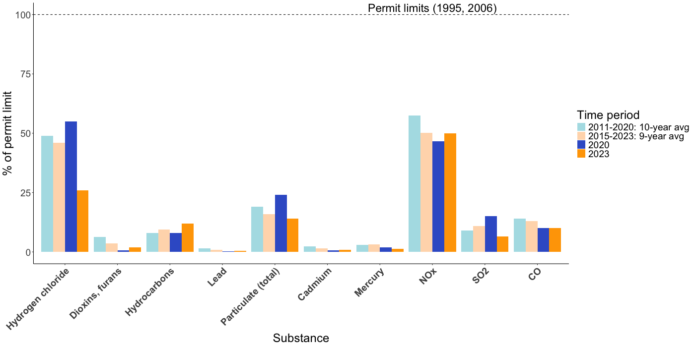
Although HERC’s permit is from 1998, the dashed line indicates 1995 and 2006 because the EPA standards that form the basis of HERC’s permit are mostly from 1995 with a few updates in 2006.

However, the MN Pollution Control Agency (MPCA) issued the HERC’s permit in 1998, close to 30 years ago. Since then, updates have only been made in 2006 to cadmium, mercury, and lead limits (EPA 2024). Making safety claims using only these permit limits is linked to several points of concern.

Concern 1: HERC’s permit limits are NOT based on health standards

Key Idea

HERC’s permit limits are based on technology considerations rather than health standards.

As discussed above*, the first phase of hazardous pollutant regulation is a technology-based phase in which pollutant limits are set based on the capacities of available pollution control technology, so called maximum achievable control technology (MACT) standards. These limits may not necessarily align with levels that are safe for health.

*See section on hazardous pollutants.

The second phase of hazardous pollutant regulation (the residual risk assessment) evaluates health risks after MACT standards have been applied, but this phase has not been carried out for municipal waste incinerators. (This residual risk assessment was supposed to have taken place in 2003, 8 years after the 1995 MACT standards were set.)

Concern 2: HERC’s permit limits are based on improperly set EPA limits

Key Idea

HERC’s air pollution permit limits come from the EPA’s MACT limits, and these MACT limits were found to have been set in a manner that was inconsistent with the Clean Air Act.

In 2008, the Sierra Club petitioned the EPA over MACT limits at a federal district court (EPA 2024). They argued that the EPA’s MACT limits were based in part on state-level air pollution permits, rather than on the average emissions from the best 12% of facilities of the same type (the CAA’s stipulation). Thus, it cannot be accurately claimed that the EPA’s pollution limits (which were used for HERC’s permit) were as stringent as they should have been.

See Clean Air Act section 112(d)(3).

Concern 3: HERC’s permit limits are outdated and less stringent than modern standards

Key Idea

The MACT limits reflected in the HERC permit are outdated. Many HERC pollutant levels would surpass limits in a modern permit.

In 2024, the EPA proposed new air pollution limits (MACT limits) for municipal solid waste incinerators (EPA 2024). The figure below shows how HERC pollutant levels would compare to these new proposed limits. The black dashed lines reflect new limits for existing incinerators (such as HERC), and the red dashed lines reflect new (more stringent) limits for incinerators built in the future. While the black lines would legally apply to HERC, the red lines are what would apply if the best available pollution control equipment was required for HERC.

These dashed lines show new pollutant limits as a percentage of HERC’s existing permit limits.

Under the strictest limits (red lines), several HERC pollutants (namely, hydrogen chloride, particulate matter, nitrogen oxides, and carbon monoxide) exceed or are close to exceeding these limits.

The same bar chart as above is shown, with the addition of black and red horizontal dashed lines for each pollutant. These dashed lines are generally at 50% or lower, indicating much more stringent proposed new air pollution standards.

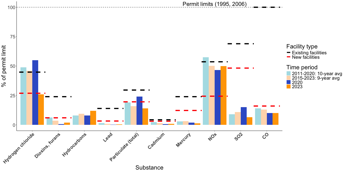
The tables below show how HERC pollutant levels would compare to updated permit limits (as a percentage of the permit limit):

Numbers greater than 100 indicate that the permit limit would be exceeded by HERC’s pollutant levels.

Concern 4: Air pollution permits ignore the simultaneous health impacts of multiple pollutants

Key Idea

Safety considerations have been evaluated for pollutants individually. However, the reality is that all pollutants exist in the air simultaneously. Even if pollutant limits set by regulatory agencies are at low enough levels for individual pollutants in isolation, the cumulative risk of adverse health impacts from all pollutants existing in the air simultaneously is unknown.

The importance of assessing the health impacts of air pollution mixtures has only recently gained appreciation, and analytical methods for assessing these impacts are being actively developed. As we wait for the development of scientific literature on health impacts of complex air pollution mixtures, we can gain some preliminary understanding by looking at existing literature on interaction effects of a few factors at a time.

Anenberg et al. (2020) examine three factors (air pollution, air temperature, and pollen levels) and perform a systematic literature review to assess evidence for synergistic effects of combinations of those factors. They find evidence for a synergistic relationship between heat and air pollution (particularly ozone and particulate matter) on all-cause mortality, cardiovascular outcomes, and respiratory outcomes. From these results, it is reasonable to believe that different air pollutants have synergistic effects as well. Thus, it is important that air pollution limits are even more stringent to compensate.

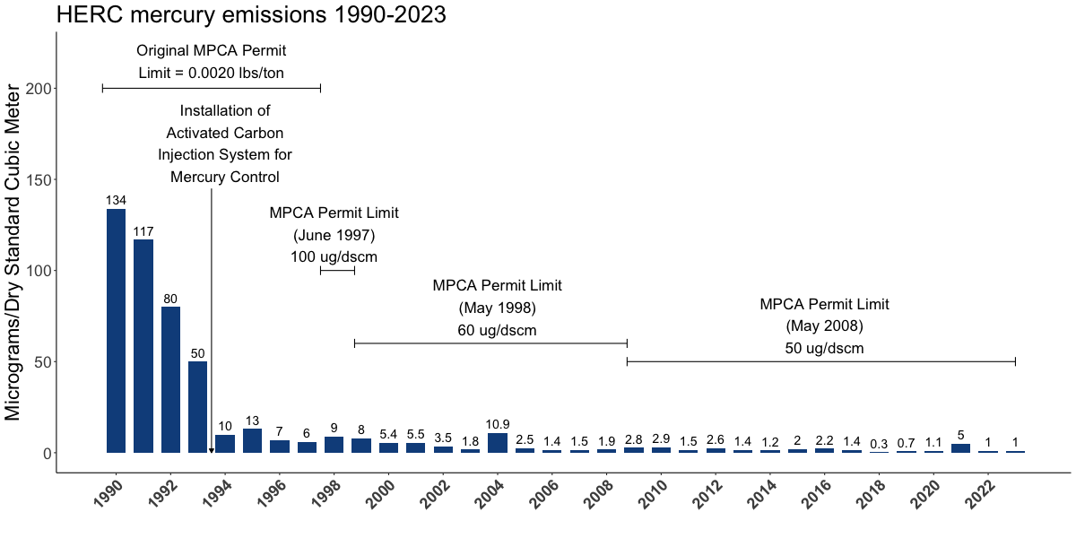
Concern 5: History calls for taking a precautionary approach

Key Idea

History shows us that society regularly underestimates or misjudges the harm of environmental pollutants. Thus, it is important to adopt more stringent standards now in anticipation of future changes to our understanding.

The following figure of the HERC’s mercury (Hg) concentrations over time illustrates the impacts of our changing understanding. While mercury emissions have always been below regulatory limits in place at the time, we can see that in early years, county residents were exposed to mercury levels that were much higher than currently permissible levels.

Bar chart of HERC's mercury emissions over time. One bar for each year from 1990 to 2023. Vertical axis represents mercury emissions levels in micrograms per dry standard cubic meter. Bars are annotated with a number above for the exact emission value. Years 1990-1997 are annotated with a horizontal line with the text 'Original MPCA Permit Limit = 0.0020 lbs/ton'. Arrow between years 1993 and 1995 is annoated with the text 'Installation of Activated Carbon Injection System for Mercury Control'. A horizontal line spanning 1998 is annotated with the text 'MPCA Permit Limit (June 1997) 100 ug/dscm'. A horizontal line spanning years 1999-2008 is annotated with the text 'MPCA Permit Limit (May 1998) 60 ug/dscm'. A horizontal line spanning years 2009 to the latest year on the graph is annotated with the text 'MPCA Permit Limit (May 2008) 50 ug/dscm'.

Stricter standards have also been seen for particulate matter and nitrogen dioxide.

  • Particulate matter: The CAA primary standard for PM2.5 was 15 µg/m3 in 1997, lowered to 12 µg/m3 in 2012, and lowered again to 9 µg/m3 in 2024 (EPA 2025b) The World Health Organization (WHO) has proposed even stricter standard of 5 µg/m3 (WHO 2021), which is 3 times lower than the 15 µg/m3 set for the HERC when its permit was approved based on the 1997 U.S. EPA standards.

  • Nitrogen dioxide: The CAA long term standard for NO2 has not changed since 1971 when it was set at 53 ppb, last evaluated in 2018 (EPA 2025a). The short-term (1 hour) standard was first set in 2010 at 100 ppb and has not changed since. By contrast, the WHO standard for long-term exposure was reduced to 18.8 ppb in 2021 from 75 ppb in 2005 (WHO 2021). The short-term (24-hour average) of 47 ppb was also set in 2021.

Recognizing that as time goes on, new scientific understanding will likely warrant lower permissible levels of pollutants, policy can proactively anticipate these necessary reductions by aligning with the precautionary principle. The precautionary principle is a guideline for legal decision making that acknowledges that waiting for scientific certainty increases risk for current harms and that knowledge of present and future risk warrants acting sooner.

The precautionary principle is part of European Union law but is not used to the same extent in the United States.

What equity considerations are of concern for HERC pollutants?

Key Ideas
  • Disease risk is directly related to distance from the HERC: disease risks are highest close to the HERC and lower further away.
  • Although Hennepin County staff possessed data that clearly showed this clear relationship between risk and distance, they only presented data that incorrectly implied no difference in risk based on distance.
  • Distance from the HERC is an environmental justice concern because communities close to HERC are disproportionately overburdened and disadvantaged communities (environmental justice communities).
  • The cumulative impact of existing burdens and higher disease risks creates substantial inequities for the many disadvantaged communities near the HERC.

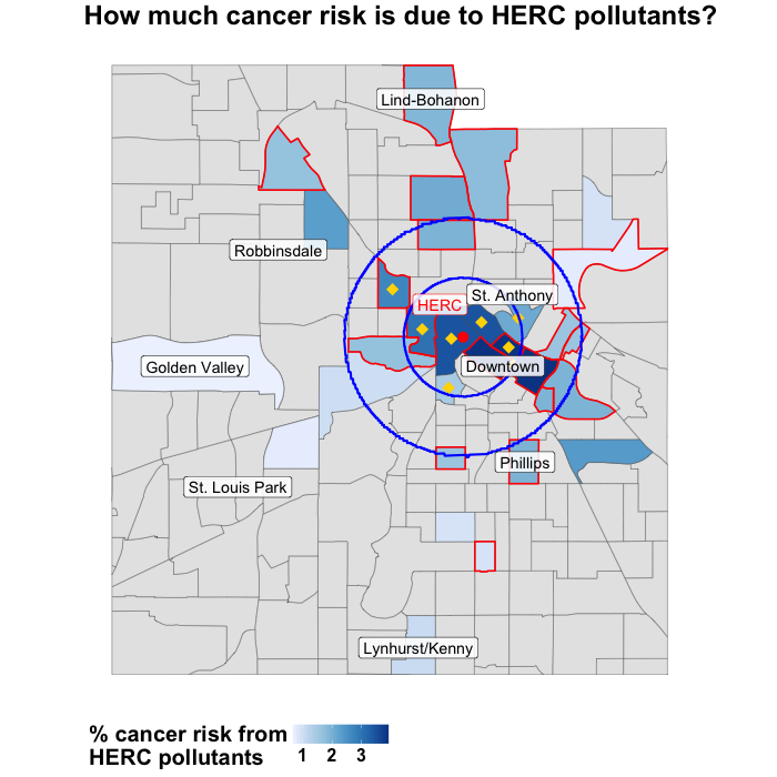
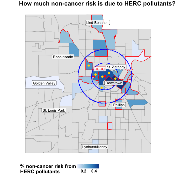
The map below shows the percentage of cancer risk that is estimated to be attributed to HERC pollutants based on data extracted from County presentations*. Risk is highest close to HERC and lower farther away.

*A later section will show updated maps based on complete risk modeling data from MPCA.
  • The two blue circles represent 1 and 2-mile areas surrounding HERC. Keep these areas in mind as you explore maps of local area characteristics later on this page.
  • Tracts outlined in red are environmental justice (EJ) communities*.
  • Tracts with yellow asterisks indicate the tracts for which the county showed data in their presentations.
    • The county did not display a map of this spatial information, but even if they had created a map using only data for the yellow-starred tracts, the clear decline in risk with greater distances from the HERC would not be apparent. The inclusion of further tracts like Golden Valley and Lynhurst/Kenny make this disparity clear.
*The MPCA defines EJ tracts as federally recognized tribal areas or ones in which at least 40% of residents are people of color, at least 35% of people reported income less than 200% of the federal poverty level, or at least 40% of people have limited English proficiency (source).

Map of census tracts in Hennepin county. Color of tracts corresponds to the percent of cancer risk in the tract that is due to HERC pollutants. Darker shades of blue indicated higher percentages and are clustered around HERC which is shown with a red dot. Tracts further away are lighter shades of blue, which indicate that lower percentages of cancer risk are due to HERC pollutants. Blue circles indicating 1 and 2-mile radii around HERC are shown. Environmental justice tracts are outlined in red and are spread out among the tracts that have data. Most of the map is gray from lack of data. Yellow dots are shown on 8 tracts, which are the ones that Hennepin County chose to show in public presentations.

The map below is analogous to the one above but for non-cancer diseases. We see the same pattern of highest risk close to HERC.

Similar figure to the above map but for non-cancer risks instead of cancer risks.

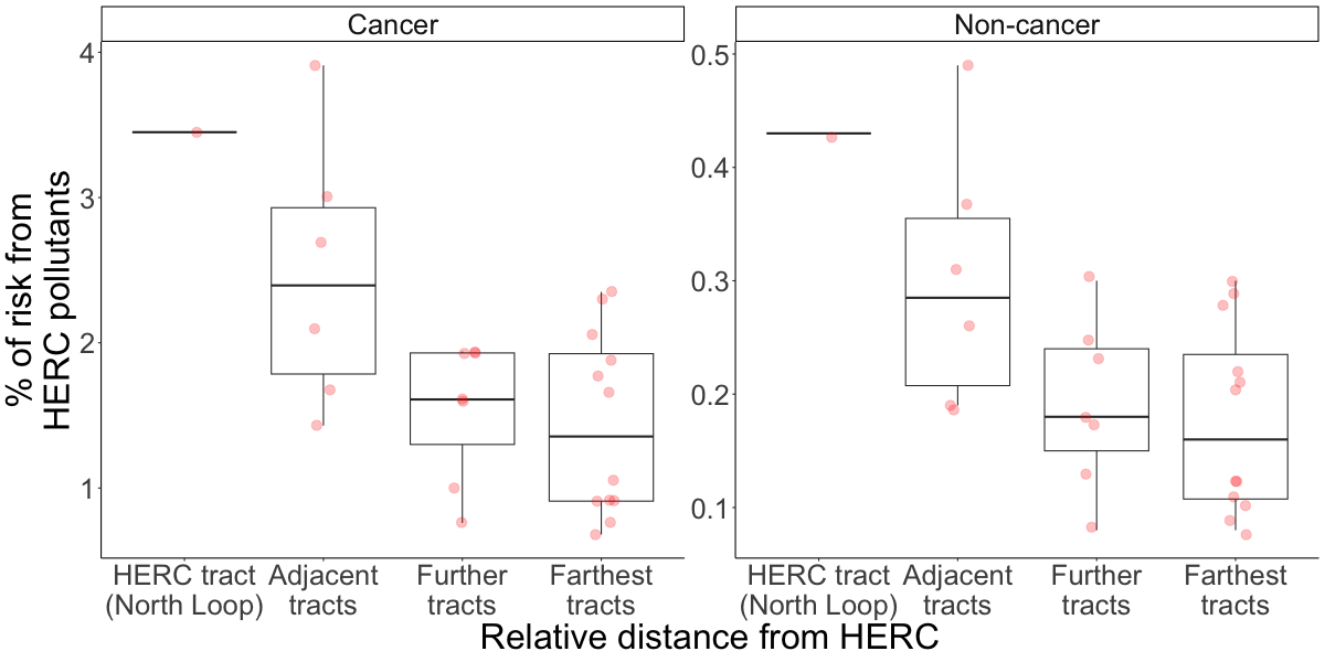
The boxplots below reinforce the large change in disease risk with distance. The thick horizontal lines represent the median percentage of risk due to HERC pollutants and show a clear decline with greater distance.

Two sets of boxplots. Left panel corresponds to cancer risks. Right panel corresponds to non-cancer risks. Horizontal axis indicates 4 groupings of tracts: HERC tract (North Loop), adjacent tracts, further tracts, farthest tracts from HERC. The vertical axis represents the percent of risk in a tract that is due to HERC pollutants. In both panels we see a decline in risk with greater distance from HERC. (Equivalently, increasing risk with closer distance to HERC.) Red dots overlay the boxplots to show all original data points.

Key Points
  • Median cancer risk in North Loop is 2.5 times that of the farthest tracts analyzed.
  • Median non-cancer risk in North Loop is 2.7 times that of the farthest tracts analyzed.

The boxplots below directly compare environmental justice (EJ) tracts with non-EJ tracts.

Two sets of boxplots. Left panel corresponds to cancer risks. Right panel corresponds to non-cancer risks. Horizontal axis has two groupings: environmental justice (EJ) tracts and non-EJ tracts. The vertical axis represents the percent of risk in a tract that is due to HERC pollutants. In both panels EJ tracts have higher risk. Red dots overlay the boxplots to show all original data points.

Key Points
  • Median cancer risk in EJ tracts is 1.8 times that in non-EJ tracts.
  • Median non-cancer risk in EJ tracts is 1.7 times that in non-EJ tracts.

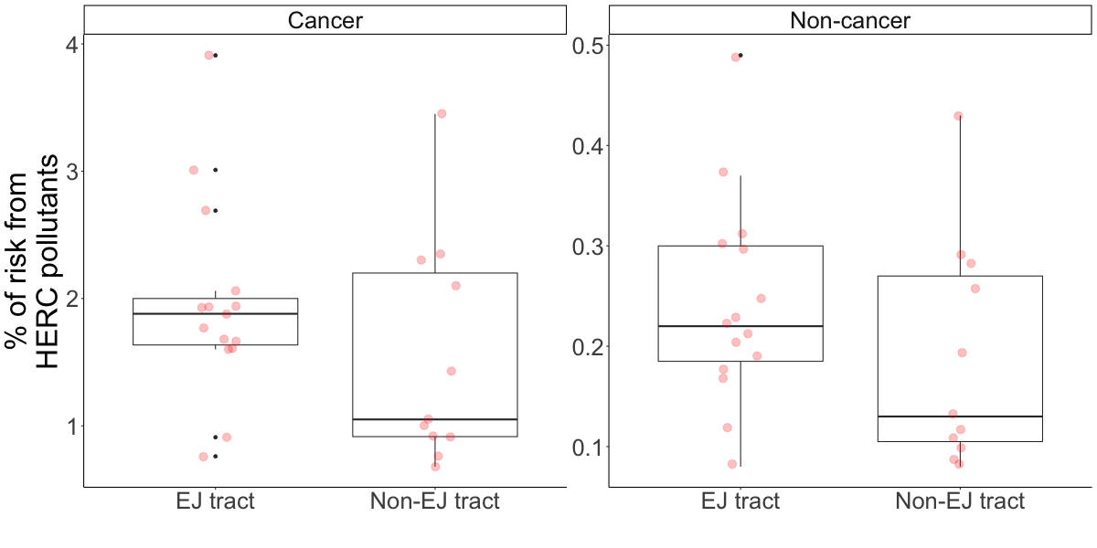
Examining health risks for EJ tracts is important because science shows that people in EJ communities are also at higher risk from a given amount of air pollution than those in non-EJ communities. The risk differences shown in the above boxplots do not include these additional risks for EJ communities. In a later section, we review findings from the scientific literature on the increased susceptibility of EJ communities to health impacts.

Who lives close to HERC?

The map below displays social, health, environmental, and climate burden characteristics of census tracts around HERC (blue pin). There are many tracts with high burden within 2 miles of HERC. The combination of these high burdens and high disease risk from HERC pollutants creates a serious environmental justice concern.

Exploring the map

Use the layers toggle in the top right to switch between these 4 indices. Index values range from 0 to 1 with numbers close to 1 indicator greater burden. You can click on a tract to see the its index value.

🔎 Compare the patterns in the 1 and 2-mile areas around HERC (blue circles) in this map and the disease risk maps above. You’ll see that areas close to HERC have the highest disease risks as well as high social and health burdens relative to the rest of the state.


The social vulnerability index includes:

  • % of people who identify as minorities
  • % of housing units that are renter-occupied
  • % of households that make less than $75,000 who are considered burdened by housing costs (i.e., pay greater than 30% of monthly income on housing expenses)
  • % of people uninsured with health insurance
  • % of people without internet
  • % of people age 65+
  • % of people age 17-
  • % of civilian non-institutionalized population with a disability
  • % of persons (age 5+) who speak English “less than well”
  • % of housing units designated as mobile homes
  • % of persons living in group quarters
  • % with income less than 200% of poverty level
  • % of people (age 25+) without a high school diploma
  • % of people unemployed

The health vulnerability index includes indicators for tracts greater than 0.6666 percentile rank with:

  • Asthma
  • Cancer
  • Coronary heart disease
  • Poor mental health
  • Diabetes

The environmental burden index includes:

  • Percentile rank of annual mean days above ozone regulatory standard - 3-year average
  • Percentile rank of annual mean days above PM2.5 regulatory standard - 3-year average
  • Percentile rank of ambient concentrations of diesel PM/m3
  • Percentile rank of the probability of contracting cancer over the course of a lifetime, assuming continuous exposure
  • Percentile rank of the proportion of tract’s area within 1-mi buffer of EPA National Priority List site
  • Percentile rank of the proportion of tract’s area within 1-mi buffer of EPA Toxic Release Inventory site
  • Percentile rank of the proportion of tract’s area within 1-mi buffer of EPA Treatment, Storage, and Disposal site
  • Percentile rank of the proportion of tract’s area within 1-mi buffer of EPA risk management plan site
  • Percentile rank of the proportion of tract’s area within 1-mi buffer of coal mines
  • Percentile rank of the proportion of tract’s area within 1-mi buffer of lead mines
  • The inverse of the percentile rank of the proportion of tract’s area within 1-mi buffer of green space, to represent tracts that are not within 1-mi of a park or greenspace
  • Percentile rank of the percentage of houses built pre-1980 (to estimate lead exposure)
  • The inverse of the percentile rank of the National Walkability Index (NWI) estimate
  • Percentile rank of the proportion of tract’s area within 1-mi buffer of railway
  • Percentile rank of the proportion of tract’s area within 1-mi buffer of high volume road or highway
  • Percentile rank of the proportion of tract’s area within 1-mi buffer of airport
  • Percentile rank of the percentage of the tract that intersects an impaired/impacted watershed at the HUC12 level

The climate burden index includes:

  • Percentile rank of the number of extreme heat days
  • Percentile rank of average annualized burned area from wildfires
  • Percentile rank of average annualized frequency of smoky days from wildfire smoke
  • Percentile rank of average annualized frequency of coastal flooding events
  • Percentile rank of average annualized frequency of drought events
  • Percentile rank of average annualized frequency of hurricane events
  • Percentile rank of average annualized frequency of riverine flooding events
  • Percentile rank of average annualized frequency of strong wind events
  • Percentile rank of average annualized frequency of tornado events

What does science say about increased pollution harms for EJ communities?

Morello-Frosch et al. (2011) provide a seminal systematic review of the literature on cumulative impacts of environmental exposures and social burdens. They identify four key themes in this review. The first two themes clearly state the persistent differences in health and environmental experiences between advantaged and disadvantaged communities:

  1. Health disparities between advantaged and disadvantaged groups are substantial and consistently observed.
    • Three classes of health outcomes are of particular concern for cumulative impacts research because they are exacerbated by both social and environmental stressors: perinatal outcomes, cardiovascular disease, self-rated health.
  2. Environmental hazard inequalities between advantaged and disadvantaged groups are consistently observed.
    • Polluting sources are consistently located in communities with racial or ethnic minorities and in socially disadvantaged communities.
    • Disadvantaged individuals are consistently exposed to pollutants through their housing, occupation, and neighborhood environments.
    • In addition to direct exposures, poor communities also suffer through the lack of health-promoting resources.

The last two themes categorize factors that can exacerbate the impacts of environmental exposures:

  1. Intrinsic biological factors can modify the effect of environmental exposures on disease susceptibility.
    • Age: Children and the elderly have increased susceptibility. The elderly have an altered immune response and weaker respiratory and cardiovascular systems. Children have unique characteristics of absorption and metabolism that affect their susceptibility. They also engage in susceptibility-increasing behaviors: playing outside and more frequent hand-to-mouth contact.
    • Genetics and gene expression: The effect of pollutants on health can be modified by certain genetic variants and can also modify the expression of genes which can affect susceptibility as time passes.
    • Preexisting health conditions: Individuals with certain preexisting health conditions (like diabetes, obesity, and cardiovascular disease) are at higher risk for pollutant-driven diseases.
  2. Extrinsic social vulnerability factors can modify the effect of environmental exposures on disease susceptibility.
    • Social factors such as race, ethnicity, and sex can exacerbate the effect of environmental exposures. Examples have been seen for low socioeconomic status exacerbating the effect of air pollution on preterm births, low birthweight, and adult mortality.
    • Psychosocial factors such as exposure to violence and heightened stress can also exacerbate air-pollution related health outcomes.

Two studies that were conducted after this review reinforce the above themes:

  • Chi et al. (2016) studied cumulative impacts in a large cohort of women participating in the Women’s Health Initiative observational study. They found that a given amount of PM2.5 exposure was exacerbated for women living in neighborhoods of low socioeconomic status (SES). The fact that SES characteristics of neighborhood and not individuals were the exacerbating factor highlights the importance of addressing systemic community-level harms and lack of resources.

  • Di et al. (2017) studied cumulative impacts in a massive cohort of all Medicare beneficiaries from 2000 to 2012. They found that in terms of risk of death, a given amount of PM2.5 exposure was exacerbated for men, blacks, and people with Medicaid eligibility. In particular, the mortality effect estimate (on the log scale) for PM2.5 was 3 times higher for black individuals than for the overall population.

How did the county examine and present the data?

In February 2022, Hennepin County gave a presentation on HERC emissions that included the following conclusion:

HERC is not likely to cause more harmful cancer or non-cancer health effects in one part of the community than another (equally low impact on surrounding communities)

How the county came to such a conclusion in light of the maps shown above seems baffling. However, in examining the county’s slides, we can see that the data was not displayed in a way that allowed them to make statements about how disease risk varies across communities. The county showed data on cancer and non-cancer risks for 6 census tracts via the slides below. These are the same 6 tracts marked by yellow diamonds in the figures above and below.

The county hired a consulting firm called Barr Engineering for the health risk analysis. A public presentation of the Barr Engineering analysis is available here.

Cancer and non-cancer risk percentages due to HERC pollutants for North Loop Cancer and non-cancer risk percentages due to HERC pollutants for Sumner Glenwood Cancer and non-cancer risk percentages due to HERC pollutants for St. Anthony West/Nicollet Island-East Bank Cancer and non-cancer risk percentages due to HERC pollutants for Downtown West/East Cancer and non-cancer risk percentages due to HERC pollutants for Loring Park Cancer and non-cancer risk percentages due to HERC pollutants for Near North/Willard-Hay

Separate bar charts for different communities on different slides makes it practically impossible to understand how disease risk varies spatially. Map visualizations are essential for spatial explorations, but the county never presented a map of disease risks. Further, the census tracts in these bar graphs represent a misleading subset of Hennepin County tracts because they exclude the majority of the County more distant form HERC. These more distant tracts tend to be white and wealthier non-EJ communities.

Furthermore, the bar charts convey a misleading message that because HERC emissions are so small relative to all other sources, HERC emissions are safe and justifiable. If that thinking were applied elsewhere, we would conclude that guns are not a concern. (!!!) In fact, gun deaths made up only 1.51% of all deaths in 2023!

Bar chart that parallels the above charts made by Hennepin County. Vertical axis represents the % of deaths due to different causes in 2023. Small red portion of the bar indicates gun deaths (1.51%). Large gray portion of the bar represents all other causes (98.49%)

Warning

Just because a source of harm contributes a small amount of harm relative to all other sources does NOT make it benign or unimportant to address.

The county also used ineffective data visualizations to assess the differences in disease risk in environmental justice (EJ) communities and non-EJ communities. The county presented the data using the slide below. Each bar represents one census tract. The total height of the blue sections of the bars represents total disease risk in the tract. The orange sections of the bars (at the bottom) represent the risk from HERC pollutants.

Hennepin County slide titled 'Total cancer rick comparison of EJ and non-EJ designated tracts'. A bar chart is presented below. Vertical axis represents cancer risk. Each bar corresponds to one census tract analyzed. 14 EJ tracts on the left. 12 non-EJ tracts on the right. Horizontal line at 1.00E-05 annotated with 'Incremental Risk Guideline Value'. Each bar has an orange and a blue part. The orange part represents HERC's contribution to cancer risk. All orange bars are below the Incremental Risk Guideline Value Line.

It is impossible to see the average height of bars in the above presentation. However with the boxplots shown previously (repeated below), we see clearly that disease risks in EJ tracts are higher than in non-EJ tracts.

Two sets of boxplots. Left panel corresponds to cancer risks. Right panel corresponds to non-cancer risks. Horizontal axis has two groupings: environmental justice (EJ) tracts and non-EJ tracts. The vertical axis represents the percent of risk in a tract that is due to HERC pollutants. In both panels EJ tracts have higher risk. Red dots overlay the boxplots to show all original data points.

What do complete data on health risk modeling show?

The maps above that showed how much risk in an area is attributable to HERC pollutants only showed data for a small number of census tracts. (Above maps are reproduced below.) It could be that HERC staff chose to show results for a small number of census tracts because of the way they decided to display results for individual census tracts (see previous section).

Map of census tracts in Hennepin county. Color of tracts corresponds to the percent of cancer risk in the tract that is due to HERC pollutants. Darker shades of blue indicated higher percentages and are clustered around HERC which is shown with a red dot. Tracts further away are lighter shades of blue, which indicate that lower percentages of cancer risk are due to HERC pollutants. Blue circles indicating 1 and 2-mile radii around HERC are shown. Environmental justice tracts are outlined in red and are spread out among the tracts that have data. Most of the map is gray from lack of data. Yellow dots are shown on 8 tracts, which are the ones that Hennepin County chose to show in public presentations. Similar figure to the map on the left but for non-cancer risks instead of cancer risks.

Through a data request to the MPCA, we were able to look at complete data from Minnesota’s health risk modeling tool (called MNRISKS, and discussed more in the next section). This complete data comes from the 2017 version of the MNRISKS model and information is at the block group level, which is a finer area than the census tract level. (Block groups are subdivisions of census tracts.) We recreated the above maps to show the percent of health risk in a block group that is due to HERC pollutants.

Map of census tracts in Hennepin county. Color of tracts corresponds to the percent of cancer risk in the tract that is due to HERC pollutants. Darker shades of blue indicated higher percentages and are clustered around HERC which is shown with a red dot. Tracts further away are lighter shades of blue, which indicate that lower percentages of cancer risk are due to HERC pollutants. Blue circles indicating 1 and 2-mile radii around HERC are shown. Environmental justice tracts are outlined in red and are spread out among the tracts that have data. Most of the map is gray from lack of data. Yellow dots are shown on 8 tracts, which are the ones that Hennepin County chose to show in public presentations. Similar figure to the map on the left but for non-cancer risks instead of cancer risks.

While the overall pattern of higher health risks close to HERC and lower risks further away is the same, the scale is somewhat different. In this analysis, we see that the maximum of the percent of health risks due to HERC pollutants is higher than shown in the county presentations from which we extracted data for the earlier maps—this is true for both cancer and non-cancer conditions. The interquartile range (IQR) for non-cancer conditions is similar between this analysis and the extracted data from county presentations, and the cancer IQR is slightly lower in this analysis.

The table below summarizes the differences in scale between (1) the analyses using the county’s presentation data and (2) the analyses that used the complete raw data from MPCA. Overall, the data from county presentations shows percent risks from HERC pollutants that are about

  • Cancer: 2 times higher for the IQR and 2.5 times lower for the maximum
  • Non-cancer: Similar for the IQR but about 8 times lower for the maximum

This difference in scale persists whether comparing county data (which is at the tract level) to block group level or tract level summarized from block group data.

Why did these differences in scale arise? Differences are not likely due to differences in data sources. Our data come from the 2017 version of the MNRISKS modeling tool, and the county’s data likely did too since their presentations were from 2023. (The 2020 version of MNRISKS modeling is not available from the MPCA at the moment.) Thus differences in scale are likely due to differences in processing. To better understand what happened, we would need to examine the code used to analyze the data for the county presentations.

IQR: Interquartile range (25th - 75th percentile)
[M1]: Mean across block groups
[M2]: Weighted mean across block groups (weighted by block group land and water area)
[M3]: Weighted mean across block groups (weighted by block group land area only)
Tract-level data
from county presentations
Block group-level data
from MPCA
Tract-level data summarized from MPCA block group data
Cancer IQR: 1.15 - 2.25 (Max: 3.91) IQR: 0.65 - 1.30 (Max: 11.72) [M1]: IQR: 0.64 - 1.27 (Max: 10.83)
[M2]: IQR: 0.62 - 1.28 (Max: 9.85)
[M3]: IQR: 0.62 - 1.28 (Max: 9.96)
Non-cancer IQR: 0.14 - 0.30 (Max: 0.49) IQR: 0.19 - 0.41 (Max: 4.51) [M1]: IQR: 0.19 - 0.40 (Max: 4.10)
[M2]: IQR: 0.19 - 0.40 (Max: 3.65)
[M3]: IQR: 0.18 - 0.40 (Max: 3.70)

How were health risks estimated?

The health risk data from the county’s slides comes from a pollution risk assessment tool called MNRISKS. Results from MNRISKS are associated with two notable cautions: (1) exclusion of key pollutants from health risk estimations and (2) not accounting for higher susceptibility and vulnerability in environmental justice (EJ) communities.

Caution: MNRISKS excludes important pollutants from health risk estimations

The MNRISKS documentation notes that important pollutants are not included in health risk estimations:

Note that criteria pollutants without inhalation health benchmarks, including PM2.5 and PM10, are not included in the calculation of risks. These pollutants are included for evaluating air concentrations and model performance. Section 4.4 (top of page 21)

We also know that PFASs are not monitored or regulated by HERC and thus not available for health risk estimation.

Even from the exclusion of particulate matter (PM) alone, there is likely a notable underestimation of health risks. Recent independent risk assessment using a U.S. EPA model and public emission data estimated that HERC PM2.5 emissions cause 1-2 premature deaths annually and about $16 million damage on a statewide basis (Nunez, Shetty, and Mcphail 2023), with most of the exposure occurring near the HERC. This assessment does not include the many other air pollutants that HERC emits. It also does not include consider the increased susceptibility of EJ communities to health impacts and non-mortality health outcomes that are still significant.

Given the scale of PM health impacts, any additional pollutants excluded from health risk estimations in MNRISKS would entail more substantial underestimation of risk.

How safe is the management of incinerator ash?

Incinerators have a deceptive appeal to them: they purport to deal with trash by burning it away.

However, it is a simple matter of physics that incinerators cannot burn trash into nonexistence: mass cannot be destroyed—just changed in form. Incinerators convert trash into airborne and solid forms of pollution via the air pollution discussed previously and ash.

Dealing with ash, like air pollution, is rife with problems and complexities. The importance of safely dealing with ash byproducts has been recognized before with coal ash: groundwater contamination from toxic coal ash had become so problematic that the EPA instituted a rule that will force coal companies to clean up coal ash dump sites through more stringent wastewater treatment standards.

Incinerators generate a nontrivial amount of ash: 100 pounds of municipal solid waste results in about 25 pounds of ash (Zero Waste Europe 2022). The concentration of toxins in ash can be so high that standard wastewater treatment strategies are insufficient. In these situations, there can be some considerable lag time before adequate solutions can be found.

Ash containment can also be a concern. Popov et al. (2021) report that ash can migrate from a dumping area via air and water to contaminate air, soil, groundwater, and surface water within a few kilometers of the dump site. Landfill covers have the potential to prevent ash from spreading, but there is considerable variability in efficacy based on the material used for the cover, how completely it covers the waste, and how the process of applying the cover is physically managed. We have not yet found studies of the efficacy of landfill covers in preventing ash dispersal via wind are hard to find.

Ash has been proposed as a renewable building material by serving as a basis for material used in road construction (including projects in Minnesota). However the safety of this practice is highly questionable. Several studies have found that toxic compounds in ash leach out in realistic conditions (e.g., the slightly acidic environment of normal rain) (Zero Waste Europe 2022), a finding that the EPA has also reported. Several studies have also documented the high variability in the results of leaching tests depending on testing conditions (Zero Waste Europe 2022): the composition and pH of the solution in which the ash is tested as well as the technology used for testing can all have large impacts on the amounts of toxic compounds detected.

In the United States, incinerator ash and its testing are under-regulated. The EPA’s latest guidance for testing the toxicity of incinerator ash is from 1995. In contrast, the EPA has regularly updated coal ash regulations, with a major update in 2014 and smaller updates every few years since. Because of the variability in how incinerator ash is dealth with, we need to be cautious about reports on ash toxicity without detailed information about how the leaching tests were performed.

Incinerator ash from the HERC is sent to the SKB Environmental landfill in Rosemount, MN where there have been plans to substantially increase the amount of landfill space. The construction of the expanded space could lead to ash exposure and unintended dispersal. If the landfill liners in the existing and expanded landfill areas are not seamless, there could also be increased risk for groundwater contamination. The increased surface area of the landfill alone could increase the risk of groundwater contamination.

How do incinerators compare to landfills?

Proponents of waste incinerators claim that incinerators are safer than landfills. Is that really the case?

The figures below show normalized emissions for 3 landfills and 5 incinerators in Minnesota. Annual total emissions are normalized by dividing emissions by the annual capacity of the landfill/incinerator. This allows us to more fairly compare the air pollution impact of sending a given mass of waste to a landfill vs. an incinerator: How much pollution does 1 ton of waste at an incinerator generate? vs. How much pollution does 1 ton of waste at a landfill generate?

Air pollution data comes from the MPCA Point Source Emissions Inventory. A interactive exploration tool for that data is available here.

The 3 landfills analyzed were:

  • Burnsville Sanitary Landfill
  • Spruce Ridge Resource Management Facility
  • Elk River Landfill

Data on landfill capacity and annual usage were obtained from this MCEA report on metro area landfill capacity. The Pine Bend Landfill in Dakota County is analyzed in the MCEA report but not here because it was not found in the MPCA Point Source Emissions Inventory.

The 5 incinerators analyzed were:

  • Hennepin Energy Recovery Center
  • Olmsted Waste-to-Energy Facility
  • Perham Resource Recovery Facility
  • Polk County Solid Waste Resource Recovery
  • Pope/Douglas Solid Waste Management

This listing from the MN Resource Recovery Association (MRRA) of waste-to-energy facilities in Minnesota served as the starting point for finding which incinerators could be analyzed. The 5 incinerators listed above differ from the MRRA listing for the following reasons:

  • Xcel French Island: Located in La Crosse, WI and not part of the MPCA Point Source Emissions inventory
  • Prairie Lakes: Now called the Perham Resource Recovery Facility and included in our analysis
  • Xcel Red Wing: This is a biomass burning plant rather than a municipal solid waste incinerator
  • Xcel Mankato: Xcel sold this facility in 2020. It is now called the Mankato Energy Center and [uses natural gas as a fuel source](https://mn.gov/commerce/energyfacilities/Docket.html?Id=34238.

Note that for landfills, normalizing emissions by dividing by annual capacity does not perfectly represent the amount of pollution that a ton of landfill waste would emit in its lifetime before degrading fully. This is because it assumes that all of a landfill’s yearly emissions are due only to the new waste coming to the landfill that year and not at all to the waste already in place at the landfill. At the same time, a ton of landfill waste likely continues to emit pollutants beyond one year, so there is some need to accrue emissions for a ton of waste over time. Given the variability in composition of municipal solid waste and the lack of knowledge about how long waste continues to emit pollutants, this normalized measure is our best attempt to fairly compare incinerator and landfill emissions.

The figures below show normalized emissions for key pollutants as well as greenhouse gas (GHG) emissions from 2012 to 2023. Examinination of the figures suggests that there is no clear safer option.

  • Normalized PM emissions seem to be somewhat higher for landfills, though this has varied over time.
  • Normalized SO2 emissions are higher for incinerators than landfills on average, but HERC’s SO2 emissions are lower among the incinerators examined.
  • Normalized NOx, Hg, and greenhouse gas (GHG) emissions (CO2-equivalent) are consistently several fold higher for incinerators.
  • Normalized CO emissions are consistently several fold higher for landfills.
  • Normalized VOC emissions were several fold higher for landfills in the early years of available data (2012-2016) but the average difference between landfills and incinerators was very small from 2017-2023. HERC’s VOC emissions are lower among the incinerators examined.

References

Anenberg, Susan C, Shannon Haines, Elizabeth Wang, Nicholas Nassikas, and Patrick L Kinney. 2020. “Synergistic Health Effects of Air Pollution, Temperature, and Pollen Exposure: A Systematic Review of Epidemiological Evidence.” Environ. Health 19 (1): 130. https://doi.org/10.1186/s12940-020-00681-z.
Björklund, Sofie, Eva Weidemann, and Stina Jansson. 2023. “Emission of Per- and Polyfluoroalkyl Substances from a Waste-to-Energy Plant─occurrence in Ashes, Treated Process Water, and First Observation in Flue Gas.” Environmental Science & Technology 57 (27): 10089–95. https://doi.org/10.1021/acs.est.2c08960.
Chi, Gloria C, Anjum Hajat, Chloe E Bird, Mark R Cullen, Beth Ann Griffin, Kristin A Miller, Regina A Shih, et al. 2016. “Individual and Neighborhood Socioeconomic Status and the Association Between Air Pollution and Cardiovascular Disease.” Environ. Health Perspect. 124 (12): 1840–47. https://doi.org/10.1289/EHP199.
Di, Qian, Yan Wang, Antonella Zanobetti, Yun Wang, Petros Koutrakis, Christine Choirat, Francesca Dominici, and Joel D Schwartz. 2017. “Air Pollution and Mortality in the Medicare Population.” N. Engl. J. Med. 376 (26): 2513–22. https://doi.org/10.1056/NEJMoa1702747.
EPA. 2024. Standards of Performance for New Stationary Sources and Emission Guidelines for Existing Sources: Large Municipal Waste Combustors Voluntary Remand Response and 5-Year Review.” https://www.federalregister.gov/documents/2024/01/23/2024-00747/standards-of-performance-for-new-stationary-sources-and-emission-guidelines-for-existing-sources.
———. 2025a. “Timeline of Nitrogen Dioxide (NO2) National Ambient Air Quality Standards (NAAQS).” https://www.epa.gov/no2-pollution/timeline-nitrogen-dioxide-no2-national-ambient-air-quality-standards-naaqs.
———. 2025b. “Timeline of Particulate Matter (PM) National Ambient Air Quality Standards (NAAQS).” https://www.epa.gov/pm-pollution/timeline-particulate-matter-pm-national-ambient-air-quality-standards-naaqs.
Morello-Frosch, Rachel, Miriam Zuk, Michael Jerrett, Bhavna Shamasunder, and Amy D Kyle. 2011. “Understanding the Cumulative Impacts of Inequalities in Environmental Health: Implications for Policy.” Health Aff. (Millwood) 30 (5): 879–87. https://doi.org/10.1377/hlthaff.2011.0153.
Nunez, Yanelli, Karan Shetty, and Ana Mcphail. 2023. “Cumulative Burden Analysis for Zip Codes 55407 & 55411.” PSE Healthy Energy.
Popov, Oleksandr, Andrii Iatsyshyn, Valeriia Kovach, Volodymyr Artemchuk, Iryna Kameneva, Oksana Radchenko, Kyrylo Nikolaiev, Valentyna Stanytsina, Anna Iatsyshyn, and Yevhen Romanenko. 2021. “Effect of Power Plant Ash and Slag Disposal on the Environment and Population Health in Ukraine.” J. Health Pollut. 11 (31): 210910. https://doi.org/10.5696/2156-9614-11.31.210910.
WHO. 2021. “WHO Global Air Quality Guidelines: Particulate Matter (PM2.5 and PM10), Ozone, Nitrogen Dioxide, Sulfur Dioxide and Carbon Monoxide.” https://www.ncbi.nlm.nih.gov/books/NBK574591/.
Zero Waste Europe. 2022. “Toxic Fallout: Waste Incinerator Bottom Ash in a Circular Economy.”